" height="48.00000014038086px" id="xQ5vVHKqO" width="172.73399414062501px"/></svg>)
Data Engineering
Why does an analytics project spend most of its budget before the first dashboard exists?
|
5 minutes


The iceberg illusion: the expectation vs. reality
When companies realize they need to upgrade their data infrastructure, the ultimate destination is typically clear to decision-makers: they want a clean dashboard. By looking at a screen, they want to know what the company bought in the past or how many resources it spent.
To achieve this, the companies give the data analysts the data they have: usually years of Excel sheets. Analysts assume that once this information is in a proper analytics warehouse, it will be easy to visualize and derive insights from.
This is an iceberg illusion.
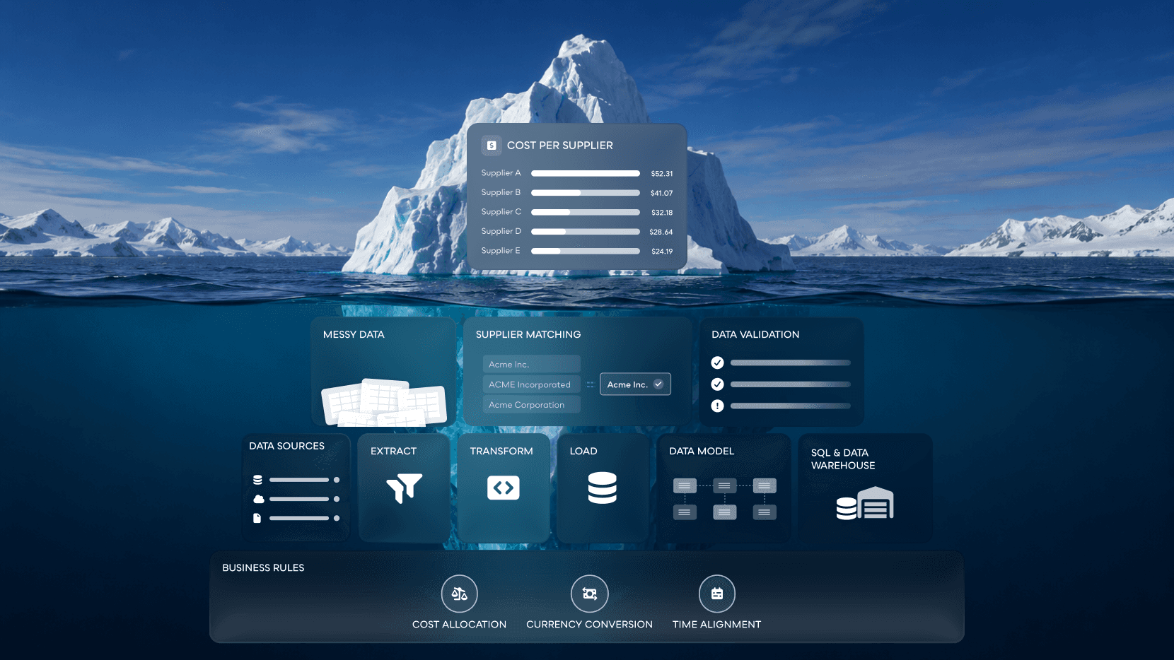
Companies that don't realize this raw data has a history of manual upkeep in the spreadsheets stay blind to the amount of preparatory work needed before anyone can build the first dashboards. Information stored in Excel sheets lacks rigor and reliability required for systematic reporting. A human can make a mistake entering a comma, omit a column identifier, or change column format from year to year, and a spreadsheet will not object to any of these actions. A data pipeline, on the other hand, does not have this flexibility. Once the data has to follow a certain logic, the weaknesses of the manual process show.
When the analysts attempt to ingest this information into the new automated system, it results in a large number of errors at the beginning of the project. We cannot simply plug in the raw Excel sheets into the visualization tools. The company would find itself quickly disillusioned with the new platform. Instead, the engineering team has to become an excavation team. For the first several weeks or months after the project or feature has started, the engineers have to reverse-engineer the client’s data preparation methods to bring this information to the level of quality suitable for systematic analysis. The company expects a short time to value. The engineering team has to deal with the majority of its allocated resources spent on fixing the legacy data before anyone can build any charts.
Exposing the weaknesses in legacy data: a real-world example
A global manufacturing company has asked for our help to report on their annual purchasing and various other statistics. Their current process involves a large number of manual steps. They tasked us with helping them build an integrated data platform to consolidate this information.
At the beginning of the project, the only source was Excel sheets. We saw real-life examples of how the manual process failed its owners. Over the first three years of data, the format of these sheets changed every year. We had to create separate pipelines for every year to parse and transform this information and bring it to a consistent format for our internal tables. We could not validate that any of this data was correct because it came straight from Excel, so we had to rely on the client to validate their figures.
The real problem manifested itself when we tried to apply business logic to this dataset. For the reporting in particular, the client wanted to track their spending habits and other statistics per supplier across years. To do that, we had to bind particular rows of information together.
Spreadsheets let you do whatever you want, pipelines do not.
As soon as we implemented the business logic necessary to chain this data together, we saw a large number of records that failed this logic test. The reason was simple: manual entry didn't produce data in the format needed for systematic analysis. The logic we designed to extract value from this information acted as a litmus test, exposing the weaknesses in the company’s data management practices. As a result, we had to rework this historical information before we could put it to real use.
Data integrity issues are the reason why discovery scope in such projects is so large, and this is when clients tend to start questioning the value of the project or feature. To get to value faster, the client tried to use the data we parsed from the Excel sheets before we had validated it properly. It did not take long for the company to realize that the data coming out of the pipeline does not match their expectations. There was nothing wrong with the data engineering itself. It simply showed the reality of the flawed manual process. To get to this point, the client has had to go through an iterative process of pulling this information out of Excel, validating it against their internal controls, and pushing it back. At this point, we were spending weeks taking the rejected rows out of the pipeline and sending them back to the client for their review. We had to correct the manual entries row by row before they could go through the pipeline again.
Engineering for a moving target
When historical data reveals weaknesses in the existing processes, it rarely stops there. To get their data in order, the clients we work with often revisit the ruleset they apply to their data management, and this creates a number of complications for the ongoing project. We had to re-engineer a substantial number of processes several times throughout the project for the manufacturing company we mentioned earlier, as the client worked to update their business rules.
In our case, we eventually got access to the internal tables the client used for some of this information. One of them was effectively a live feed of the data. The other table contained the data from closed years, in other words, the information that was supposed to be appended once a year. We expected this data to be static, but it turned out to be inconsistently updated several times throughout the year. We also didn't have access to the information showing how purchased products split across business units. We had to rely on the client to provide us with the Excels for those datasets during a specific time period.
The client had to retrofit their understanding of the costs to data that was inconsistent and updated periodically. Every time the client saw a problem with the way the data showed up in the pipeline, they identified a set of changes they wanted to see reflected in the automated process. Every single one of these requests represented a significant engineering effort. When the changes affected the data structure and transformation logic, we had to redesign parts of the data pipeline. In most cases, we could not simply update the instructions the data had to follow. The complexity of changes required us to sometimes write new pipelines to process the data in certain edge cases.
To most buyers of data engineering services, this stage represents wasted time and money. But the data engineering team was doing exactly what it had to do to fulfill its mandate, making sure that the data reflected the reality the client wanted to see. Without this step, they would not have been able to proceed to the next step of creating consolidated reports, as the automated process would fail to account for all the nuances of the manual Excel-based process.
Building the invisible architecture
This brings us to the next critical step of data engineering for historical information, building an invisible architecture that hides the complexity of the process and serves as a shock absorber for the constant changes in the business logic.
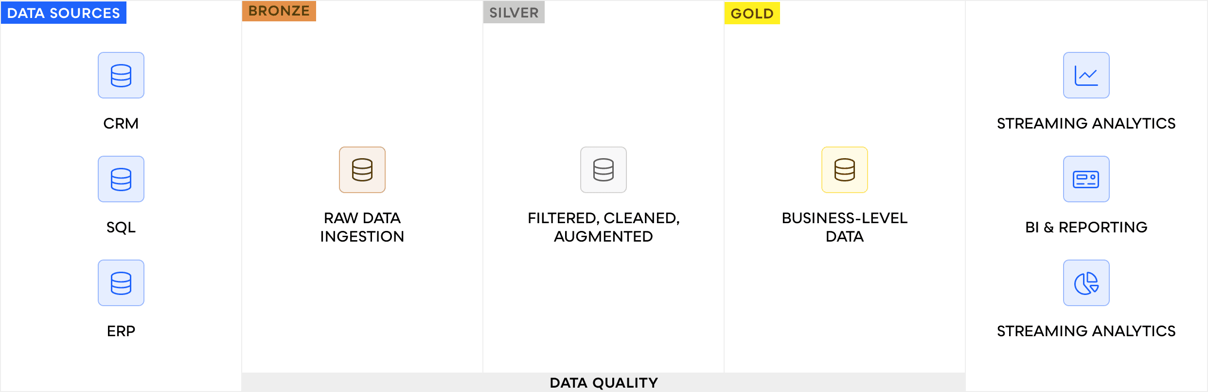
When you design the data ingestion rules directly in the production reports, every change to the business logic breaks everything. To mitigate the risk, we had to build an architecture that isolated the production reports from the constant tinkering with the logic of data transformations. We used Medallion Architecture for this.
To fulfill the client's needs, we also had to design a two-step process. The first step separated the initial data we loaded from the client's other department, the same data we used on the application side. The second step processed that data using the Databricks platform.
That first step consisted of designing a schema in the SQL database to capture and store the client's historical information and a pipeline that ingested the data into the database. At this point, we had to make several important decisions about what data quality standards we would hold this information to. That meant asking ourselves what information we were willing to sacrifice to automate the data management process. In this particular case, we had to keep some data points in the system, such as product costs without identifiers, even when they did not meet all the quality control rules, for the sake of preserving historical records.
Once the information had passed this stage, we moved it into the Databricks environment, where it underwent additional transformations and entered the Medallion system, first, the Bronze section, then the Silver, and finally the Gold. We focused most of the processing power on the middle layer, where the transformations and validations that made this information useful for reporting and analytics took place. We accommodated the client’s constant rule changes with iterative upgrades to the transformation logic in the Silver section. Once this layer was ready, we could pull the information from it to produce the actual dashboards, without further disruptions to the production rules. This architecture hid the complexity of the data transformation process from end users, who never needed to understand the challenges of turning raw data into a reliable analytical instrument.
The ROI of patience
Despite the complexity of this step, it was essential if the company wanted to automate its reporting and analytics functions. The amount of time and resources spent on this stage was substantial, and there was a lot of pressure from the stakeholders to finish this part of the project as soon as possible. Other departments wanted to start using this information for their own reports. But it was at this stage that the project spent the majority of its resources, and with good reason. Once the data could pass the quality control tests reliably and regularly, the time spent preparing it paid off.
The ROI of this step became apparent when the reporting dashboard was finally launched: the company now had a true single source of truth. It could retire its manual Excel processes in favor of an automated solution that provided it with consistent, reliable data fit for analysis. This was the promise of data engineering, an assurance that the company’s decisions were based on facts.
Conclusion
Companies that wish to benefit from data engineering need to be aware of the challenges associated with automated processing of historical information. This process is much more resource-intensive than working with data that already follows the required logic and quality control standards. To minimize the costs, companies should clearly define their reporting requirements, provide direct access to source systems, and, if possible, analyze the data before the work starts.
Frequently asked questions
How do we know if our historical data is too messy to automate?
No data is too messy to automate, but the condition of your data dictates the timeline. If your current reporting relies heavily on manual spreadsheet adjustments, expect a longer discovery and validation phase before systemic automation can happen.
Can we speed up the engineering phase?
The fastest way to speed up engineering is to provide clear, documented business rules and direct access to source systems which would also include documentation for that data so engineers don’t have to guess what data is meant for. When they have to wait for manual data drops or guess at legacy logic, the project timeline always extends.
What if we just want a simple dashboard first?
Building a simple dashboard on unvalidated data will only expose the hidden flaws in your legacy reporting. This usually leads to immediate panic from stakeholders and shifting business requirements. It is always better to build a resilient data foundation first, even if it delays the visual payoff.
Explore more stories


" height="48.00000014038086px" id="y_gzzqZQT" width="172.73500122070314px"/></svg>)
" height="59.04589570945726px" id="xfIRu88ZF" transform="translate(65.41 0)" width="59.8233px"/><path d="M 0.037 0 L 59.817 0.013 L 59.838 58.843 C 40.408 59.265 19.547 58.885 0 58.892 Z" fill="rgb(255, 255, 255)" height="59.04232000845508px" id="crREGYe3K" transform="translate(65.41 64.958)" width="59.838300000000004px"/><path d="M 0 0 L 59.452 0 L 59.471 58.949 L 0.002 58.974 Z" fill="rgb(255, 255, 255)" height="58.974479px" id="pciNNlsqV" transform="translate(0 0.013)" width="59.4711px"/><path d="M 0.013 0 L 59.449 0.009 L 59.474 58.868 L 0 58.887 Z" fill="rgb(255, 255, 255)" height="58.88719999999999px" id="MLxtpVEkA" transform="translate(0.002 64.961)" width="59.47441129px"/><path d="M 0 56 L 0 0 L 9.44 0 L 28.4 37.84 L 47.28 0 L 56.8 0 L 56.8 56 L 48.8 56 L 48.8 14 L 31.44 48.16 L 25.28 48.16 L 8 14.08 L 8 56 Z" fill="rgb(255, 255, 255)" height="55.99996px" id="z09I3buUx" transform="translate(163.088 7)" width="56.80000000000001px"/><path d="M 1.2 58 L 1.2 17.68 L 9.2 17.68 L 9.2 58 Z M 5.28 10.08 C 3.733 10.08 2.453 9.6 1.44 8.64 C 0.48 7.68 0 6.453 0 4.96 C 0 3.52 0.48 2.347 1.44 1.44 C 2.453 0.48 3.733 0 5.28 0 C 6.773 0 8.026 0.48 9.04 1.44 C 10.053 2.347 10.56 3.52 10.56 4.96 C 10.56 6.453 10.053 7.68 9.04 8.64 C 8.026 9.6 6.773 10.08 5.28 10.08 Z" fill="rgb(255, 255, 255)" height="57.99996025085449px" id="MW_dHL7DY" transform="translate(230.486 5)" width="10.560000000000002px"/><path d="M 20.16 42.24 C 16.266 42.24 12.8 41.36 9.76 39.6 C 6.72 37.787 4.32 35.307 2.56 32.16 C 0.853 29.013 0 25.36 0 21.2 C 0 16.987 0.853 13.307 2.56 10.16 C 4.32 6.96 6.72 4.48 9.76 2.72 C 12.8 0.907 16.266 0 20.16 0 C 25.066 0 29.173 1.28 32.48 3.84 C 35.786 6.4 37.893 9.867 38.8 14.24 L 30.48 14.24 C 29.946 11.893 28.72 10.08 26.8 8.8 C 24.933 7.52 22.693 6.88 20.08 6.88 C 17.946 6.88 15.973 7.44 14.16 8.56 C 12.346 9.627 10.88 11.227 9.76 13.36 C 8.693 15.44 8.16 18.027 8.16 21.12 C 8.16 23.413 8.48 25.467 9.12 27.28 C 9.76 29.04 10.613 30.533 11.68 31.76 C 12.8 32.987 14.08 33.92 15.52 34.56 C 16.96 35.147 18.48 35.44 20.08 35.44 C 21.84 35.44 23.413 35.173 24.8 34.64 C 26.24 34.053 27.44 33.2 28.4 32.08 C 29.413 30.96 30.106 29.627 30.48 28.08 L 38.8 28.08 C 37.893 32.347 35.786 35.787 32.48 38.4 C 29.173 40.96 25.066 42.24 20.16 42.24 Z" fill="rgb(255, 255, 255)" height="42.239999999999995px" id="tAl7B7lEb" transform="translate(249.606 21.72)" width="38.80000000000001px"/><path d="M 0 41.28 L 0 0.96 L 7.2 0.96 L 7.92 8.56 C 8.827 6.747 10 5.227 11.44 4 C 12.88 2.72 14.56 1.733 16.48 1.04 C 18.454 0.347 20.694 0 23.2 0 L 23.2 8.48 L 20.32 8.48 C 18.667 8.48 17.094 8.693 15.6 9.12 C 14.107 9.493 12.774 10.16 11.6 11.12 C 10.48 12.08 9.6 13.387 8.96 15.04 C 8.32 16.693 8 18.747 8 21.2 L 8 41.28 Z" fill="rgb(255, 255, 255)" height="41.28px" id="XdD7ZsBGq" transform="translate(297.766 21.72)" width="23.19999999999999px"/><path d="M 19.92 42.24 C 16.134 42.24 12.72 41.36 9.68 39.6 C 6.694 37.84 4.32 35.387 2.56 32.24 C 0.854 29.04 0 25.36 0 21.2 C 0 16.933 0.88 13.227 2.64 10.08 C 4.4 6.88 6.8 4.4 9.84 2.64 C 12.88 0.88 16.294 0 20.08 0 C 23.92 0 27.334 0.88 30.32 2.64 C 33.307 4.4 35.654 6.853 37.36 10 C 39.12 13.147 40 16.853 40 21.12 C 40 25.387 39.12 29.093 37.36 32.24 C 35.654 35.387 33.28 37.84 30.24 39.6 C 27.2 41.36 23.76 42.24 19.92 42.24 Z M 19.92 35.36 C 22.107 35.36 24.08 34.827 25.84 33.76 C 27.654 32.693 29.094 31.12 30.16 29.04 C 31.28 26.907 31.84 24.267 31.84 21.12 C 31.84 17.973 31.307 15.36 30.24 13.28 C 29.174 11.147 27.734 9.547 25.92 8.48 C 24.16 7.413 22.214 6.88 20.08 6.88 C 17.947 6.88 15.974 7.413 14.16 8.48 C 12.347 9.547 10.88 11.147 9.76 13.28 C 8.694 15.36 8.16 17.973 8.16 21.12 C 8.16 24.267 8.694 26.907 9.76 29.04 C 10.88 31.12 12.32 32.693 14.08 33.76 C 15.894 34.827 17.84 35.36 19.92 35.36 Z" fill="rgb(255, 255, 255)" height="42.239999999999995px" id="yQdFVSigS" transform="translate(325.621 21.72)" width="40px"/><path d="M 17.76 42.24 C 14.347 42.24 11.36 41.68 8.8 40.56 C 6.24 39.44 4.213 37.867 2.72 35.84 C 1.227 33.813 0.32 31.44 0 28.72 L 8.16 28.72 C 8.427 30 8.933 31.173 9.68 32.24 C 10.48 33.307 11.547 34.16 12.88 34.8 C 14.267 35.44 15.893 35.76 17.76 35.76 C 19.52 35.76 20.96 35.52 22.08 35.04 C 23.253 34.507 24.107 33.813 24.64 32.96 C 25.173 32.053 25.44 31.093 25.44 30.08 C 25.44 28.587 25.067 27.467 24.32 26.72 C 23.627 25.92 22.56 25.307 21.12 24.88 C 19.733 24.4 18.053 23.973 16.08 23.6 C 14.213 23.28 12.4 22.853 10.64 22.32 C 8.933 21.733 7.387 21.013 6 20.16 C 4.667 19.307 3.6 18.24 2.8 16.96 C 2 15.627 1.6 14 1.6 12.08 C 1.6 9.787 2.213 7.733 3.44 5.92 C 4.667 4.053 6.4 2.613 8.64 1.6 C 10.933 0.533 13.627 0 16.72 0 C 21.2 0 24.8 1.067 27.52 3.2 C 30.24 5.333 31.84 8.347 32.32 12.24 L 24.56 12.24 C 24.347 10.427 23.547 9.04 22.16 8.08 C 20.773 7.067 18.933 6.56 16.64 6.56 C 14.347 6.56 12.587 7.013 11.36 7.92 C 10.133 8.827 9.52 10.027 9.52 11.52 C 9.52 12.48 9.867 13.333 10.56 14.08 C 11.253 14.827 12.267 15.467 13.6 16 C 14.987 16.48 16.667 16.933 18.64 17.36 C 21.467 17.893 24 18.56 26.24 19.36 C 28.48 20.16 30.267 21.333 31.6 22.88 C 32.933 24.427 33.6 26.64 33.6 29.52 C 33.653 32.027 33.013 34.24 31.68 36.16 C 30.4 38.08 28.56 39.573 26.16 40.64 C 23.813 41.707 21.013 42.24 17.76 42.24 Z" fill="rgb(255, 255, 255)" height="42.239999999999995px" id="t8TuCRS86" transform="translate(372.872 21.72)" width="33.60304004328992px"/><path d="M 19.92 42.24 C 16.134 42.24 12.72 41.36 9.68 39.6 C 6.694 37.84 4.32 35.387 2.56 32.24 C 0.854 29.04 0 25.36 0 21.2 C 0 16.933 0.88 13.227 2.64 10.08 C 4.4 6.88 6.8 4.4 9.84 2.64 C 12.88 0.88 16.294 0 20.08 0 C 23.92 0 27.334 0.88 30.32 2.64 C 33.307 4.4 35.654 6.853 37.36 10 C 39.12 13.147 40 16.853 40 21.12 C 40 25.387 39.12 29.093 37.36 32.24 C 35.654 35.387 33.28 37.84 30.24 39.6 C 27.2 41.36 23.76 42.24 19.92 42.24 Z M 19.92 35.36 C 22.107 35.36 24.08 34.827 25.84 33.76 C 27.654 32.693 29.094 31.12 30.16 29.04 C 31.28 26.907 31.84 24.267 31.84 21.12 C 31.84 17.973 31.307 15.36 30.24 13.28 C 29.174 11.147 27.734 9.547 25.92 8.48 C 24.16 7.413 22.214 6.88 20.08 6.88 C 17.947 6.88 15.974 7.413 14.16 8.48 C 12.347 9.547 10.88 11.147 9.76 13.28 C 8.694 15.36 8.16 17.973 8.16 21.12 C 8.16 24.267 8.694 26.907 9.76 29.04 C 10.88 31.12 12.32 32.693 14.08 33.76 C 15.894 34.827 17.84 35.36 19.92 35.36 Z" fill="rgb(255, 255, 255)" height="42.239999999999995px" id="MJoF4I3iy" transform="translate(414.371 21.72)" width="40px"/><path d="M 5.92 57.6 L 5.92 11.84 C 5.92 9.067 6.373 6.8 7.28 5.04 C 8.24 3.28 9.627 2 11.44 1.2 C 13.253 0.4 15.44 0 18 0 L 22.72 0 L 22.72 6.8 L 19.28 6.8 C 17.36 6.8 15.973 7.2 15.12 8 C 14.32 8.747 13.92 10.08 13.92 12 L 13.92 57.6 Z M 0 24.08 L 0 17.28 L 23.6 17.28 L 23.6 24.08 Z" fill="rgb(255, 255, 255)" height="57.599959999999996px" id="UXarntGsK" transform="translate(460.022 5.4)" width="23.600000000000023px"/><path d="M 19.44 50.4 C 16.88 50.4 14.666 50 12.8 49.2 C 10.933 48.4 9.493 47.067 8.48 45.2 C 7.466 43.333 6.96 40.8 6.96 37.6 L 6.96 16.88 L 0 16.88 L 0 10.08 L 6.96 10.08 L 7.92 0 L 14.96 0 L 14.96 10.08 L 26.4 10.08 L 26.4 16.88 L 14.96 16.88 L 14.96 37.68 C 14.96 39.973 15.44 41.547 16.4 42.4 C 17.36 43.2 19.013 43.6 21.36 43.6 L 26 43.6 L 26 50.4 Z" fill="rgb(255, 255, 255)" height="50.4px" id="rxGPCyhN0" transform="translate(488.951 12.6)" width="26.399999999999977px"/><path d="M 11.132 31.856 C 8.873 31.856 6.908 31.446 5.236 30.624 C 3.564 29.803 2.273 28.659 1.364 27.192 C 0.455 25.726 0 24.024 0 22.088 L 3.872 22.088 C 3.872 23.291 4.151 24.406 4.708 25.432 C 5.265 26.43 6.072 27.236 7.128 27.852 C 8.213 28.439 9.548 28.732 11.132 28.732 C 12.511 28.732 13.684 28.512 14.652 28.072 C 15.649 27.603 16.397 26.972 16.896 26.18 C 17.424 25.388 17.688 24.494 17.688 23.496 C 17.688 22.294 17.424 21.326 16.896 20.592 C 16.397 19.83 15.708 19.214 14.828 18.744 C 13.948 18.275 12.921 17.864 11.748 17.512 C 10.604 17.131 9.401 16.735 8.14 16.324 C 5.705 15.503 3.916 14.476 2.772 13.244 C 1.628 12.012 1.056 10.414 1.056 8.448 C 1.056 6.776 1.437 5.309 2.2 4.048 C 2.992 2.787 4.107 1.804 5.544 1.1 C 7.011 0.367 8.741 0 10.736 0 C 12.701 0 14.403 0.367 15.84 1.1 C 17.307 1.833 18.451 2.845 19.272 4.136 C 20.093 5.397 20.504 6.864 20.504 8.536 L 16.632 8.536 C 16.632 7.685 16.412 6.849 15.972 6.028 C 15.532 5.207 14.857 4.532 13.948 4.004 C 13.068 3.447 11.953 3.168 10.604 3.168 C 9.489 3.139 8.492 3.329 7.612 3.74 C 6.761 4.121 6.087 4.679 5.588 5.412 C 5.119 6.145 4.884 7.04 4.884 8.096 C 4.884 9.093 5.089 9.9 5.5 10.516 C 5.94 11.132 6.556 11.66 7.348 12.1 C 8.169 12.511 9.123 12.892 10.208 13.244 C 11.293 13.596 12.496 13.992 13.816 14.432 C 15.312 14.931 16.632 15.547 17.776 16.28 C 18.949 16.984 19.859 17.894 20.504 19.008 C 21.179 20.123 21.516 21.546 21.516 23.276 C 21.516 24.743 21.12 26.136 20.328 27.456 C 19.565 28.747 18.421 29.803 16.896 30.624 C 15.371 31.446 13.449 31.856 11.132 31.856 Z" fill="rgb(255, 255, 255)" height="31.85560000000001px" id="w8T47mkhq" transform="translate(159.228 89.672)" width="21.51599999999999px"/><path d="M 10.824 23.232 C 8.77 23.232 6.922 22.763 5.28 21.824 C 3.637 20.856 2.346 19.507 1.408 17.776 C 0.469 16.016 0 13.978 0 11.66 C 0 9.284 0.469 7.231 1.408 5.5 C 2.376 3.74 3.681 2.391 5.324 1.452 C 6.996 0.484 8.858 0 10.912 0 C 13.024 0 14.886 0.484 16.5 1.452 C 18.142 2.391 19.433 3.74 20.372 5.5 C 21.34 7.231 21.824 9.27 21.824 11.616 C 21.824 13.963 21.34 16.016 20.372 17.776 C 19.404 19.507 18.098 20.856 16.456 21.824 C 14.813 22.763 12.936 23.232 10.824 23.232 Z M 10.868 20.064 C 12.129 20.064 13.302 19.756 14.388 19.14 C 15.473 18.495 16.353 17.542 17.028 16.28 C 17.702 15.019 18.04 13.464 18.04 11.616 C 18.04 9.739 17.702 8.184 17.028 6.952 C 16.382 5.691 15.517 4.752 14.432 4.136 C 13.376 3.491 12.202 3.168 10.912 3.168 C 9.68 3.168 8.506 3.491 7.392 4.136 C 6.306 4.752 5.426 5.691 4.752 6.952 C 4.106 8.184 3.784 9.739 3.784 11.616 C 3.784 13.464 4.106 15.019 4.752 16.28 C 5.426 17.542 6.292 18.495 7.348 19.14 C 8.433 19.756 9.606 20.064 10.868 20.064 Z" fill="rgb(255, 255, 255)" height="23.2316px" id="azo58an9R" transform="translate(184.928 98.296)" width="21.824000000000012px"/><path d="M 0 31.68 L 0 0 L 3.696 0 L 3.696 31.68 Z" fill="rgb(255, 255, 255)" height="31.679599999999994px" id="LFt0Z9Ky2" transform="translate(211.934 89.32)" width="3.695999999999998px"/><path d="M 8.449 22.704 C 6.747 22.704 5.251 22.367 3.96 21.692 C 2.699 21.018 1.716 19.976 1.012 18.568 C 0.338 17.16 0 15.4 0 13.288 L 0 0 L 3.697 0 L 3.697 12.892 C 3.697 15.092 4.18 16.75 5.148 17.864 C 6.116 18.979 7.48 19.536 9.24 19.536 C 10.472 19.536 11.587 19.243 12.584 18.656 C 13.582 18.04 14.359 17.175 14.916 16.06 C 15.503 14.916 15.796 13.523 15.796 11.88 L 15.796 0 L 19.492 0 L 19.492 22.176 L 16.148 22.176 L 15.928 18.304 C 15.254 19.683 14.256 20.768 12.936 21.56 C 11.616 22.323 10.121 22.704 8.449 22.704 Z" fill="rgb(255, 255, 255)" height="22.70360000000001px" id="Ic1Qujsq3" transform="translate(221.334 98.824)" width="19.49199999999999px"/><path d="M 10.296 27.544 C 8.976 27.544 7.832 27.339 6.864 26.928 C 5.896 26.518 5.148 25.828 4.62 24.86 C 4.121 23.863 3.872 22.528 3.872 20.856 L 3.872 8.492 L 0 8.492 L 0 5.368 L 3.872 5.368 L 4.356 0 L 7.568 0 L 7.568 5.368 L 13.992 5.368 L 13.992 8.492 L 7.568 8.492 L 7.568 20.856 C 7.568 22.235 7.847 23.174 8.404 23.672 C 8.961 24.142 9.944 24.376 11.352 24.376 L 13.728 24.376 L 13.728 27.544 Z" fill="rgb(255, 255, 255)" height="27.543599999999998px" id="aHLmCh_Ub" transform="translate(245.369 93.456)" width="13.99199999999999px"/><path d="M 0.704 31.9 L 0.704 9.724 L 4.4 9.724 L 4.4 31.9 Z M 2.552 5.016 C 1.818 5.016 1.202 4.781 0.704 4.312 C 0.234 3.813 0 3.197 0 2.464 C 0 1.731 0.234 1.144 0.704 0.704 C 1.202 0.235 1.818 0 2.552 0 C 3.256 0 3.857 0.235 4.356 0.704 C 4.854 1.144 5.104 1.731 5.104 2.464 C 5.104 3.197 4.854 3.813 4.356 4.312 C 3.857 4.781 3.256 5.016 2.552 5.016 Z" fill="rgb(255, 255, 255)" height="31.89959997711182px" id="adtU_ncj1" transform="translate(263.832 89.1)" width="5.103999999999985px"/><path d="M 10.824 23.232 C 8.771 23.232 6.923 22.763 5.28 21.824 C 3.637 20.856 2.347 19.507 1.408 17.776 C 0.469 16.016 0 13.978 0 11.66 C 0 9.284 0.469 7.231 1.408 5.5 C 2.376 3.74 3.681 2.391 5.324 1.452 C 6.996 0.484 8.859 0 10.912 0 C 13.024 0 14.887 0.484 16.5 1.452 C 18.143 2.391 19.433 3.74 20.372 5.5 C 21.34 7.231 21.824 9.27 21.824 11.616 C 21.824 13.963 21.34 16.016 20.372 17.776 C 19.404 19.507 18.099 20.856 16.456 21.824 C 14.813 22.763 12.936 23.232 10.824 23.232 Z M 10.868 20.064 C 12.129 20.064 13.303 19.756 14.388 19.14 C 15.473 18.495 16.353 17.542 17.028 16.28 C 17.703 15.019 18.04 13.464 18.04 11.616 C 18.04 9.739 17.703 8.184 17.028 6.952 C 16.383 5.691 15.517 4.752 14.432 4.136 C 13.376 3.491 12.203 3.168 10.912 3.168 C 9.68 3.168 8.507 3.491 7.392 4.136 C 6.307 4.752 5.427 5.691 4.752 6.952 C 4.107 8.184 3.784 9.739 3.784 11.616 C 3.784 13.464 4.107 15.019 4.752 16.28 C 5.427 17.542 6.292 18.495 7.348 19.14 C 8.433 19.756 9.607 20.064 10.868 20.064 Z" fill="rgb(255, 255, 255)" height="23.2316px" id="R0frkBTnK" transform="translate(273.83 98.296)" width="21.824000000000012px"/><path d="M 0 22.704 L 0 0.528 L 3.344 0.528 L 3.52 4.4 C 4.224 3.022 5.221 1.951 6.512 1.188 C 7.832 0.396 9.328 0 11 0 C 12.731 0 14.227 0.352 15.488 1.056 C 16.749 1.731 17.732 2.772 18.436 4.18 C 19.14 5.559 19.492 7.319 19.492 9.46 L 19.492 22.704 L 15.796 22.704 L 15.796 9.856 C 15.796 7.627 15.297 5.955 14.3 4.84 C 13.332 3.726 11.953 3.168 10.164 3.168 C 8.932 3.168 7.832 3.476 6.864 4.092 C 5.896 4.679 5.119 5.544 4.532 6.688 C 3.975 7.803 3.696 9.196 3.696 10.868 L 3.696 22.704 Z" fill="rgb(255, 255, 255)" height="22.703599999999994px" id="biFBvNVZz" transform="translate(300.836 98.296)" width="19.491999999999962px"/><path d="M 9.548 23.232 C 7.7 23.232 6.086 22.924 4.708 22.308 C 3.358 21.692 2.273 20.842 1.452 19.756 C 0.66 18.642 0.176 17.336 0 15.84 L 3.784 15.84 C 3.93 16.603 4.238 17.307 4.708 17.952 C 5.177 18.598 5.808 19.126 6.6 19.536 C 7.421 19.918 8.418 20.108 9.592 20.108 C 10.618 20.108 11.469 19.962 12.144 19.668 C 12.818 19.346 13.317 18.92 13.64 18.392 C 13.992 17.864 14.168 17.292 14.168 16.676 C 14.168 15.767 13.948 15.078 13.508 14.608 C 13.097 14.139 12.481 13.772 11.66 13.508 C 10.838 13.215 9.841 12.966 8.668 12.76 C 7.7 12.584 6.746 12.35 5.808 12.056 C 4.869 11.763 4.033 11.382 3.3 10.912 C 2.566 10.414 1.98 9.812 1.54 9.108 C 1.129 8.404 0.924 7.539 0.924 6.512 C 0.924 5.251 1.246 4.136 1.892 3.168 C 2.537 2.171 3.461 1.393 4.664 0.836 C 5.896 0.279 7.318 0 8.932 0 C 11.308 0 13.229 0.572 14.696 1.716 C 16.162 2.86 17.028 4.518 17.292 6.688 L 13.64 6.688 C 13.493 5.574 13.009 4.708 12.188 4.092 C 11.396 3.447 10.296 3.124 8.888 3.124 C 7.509 3.124 6.453 3.403 5.72 3.96 C 5.016 4.518 4.664 5.251 4.664 6.16 C 4.664 6.747 4.854 7.275 5.236 7.744 C 5.646 8.184 6.233 8.566 6.996 8.888 C 7.788 9.211 8.756 9.475 9.9 9.68 C 11.366 9.944 12.701 10.296 13.904 10.736 C 15.106 11.176 16.074 11.836 16.808 12.716 C 17.57 13.567 17.952 14.784 17.952 16.368 C 17.952 17.747 17.6 18.95 16.896 19.976 C 16.221 21.003 15.253 21.81 13.992 22.396 C 12.73 22.954 11.249 23.232 9.548 23.232 Z" fill="rgb(255, 255, 255)" height="23.2316px" id="dnQCBLUUX" transform="translate(324.914 98.296)" width="17.951999999999998px"/><path d="M 0 30.8 L 0 0 L 10.032 0 C 12.467 0 14.461 0.411 16.016 1.232 C 17.6 2.024 18.759 3.095 19.492 4.444 C 20.255 5.793 20.636 7.333 20.636 9.064 C 20.636 10.736 20.255 12.262 19.492 13.64 C 18.759 14.99 17.615 16.075 16.06 16.896 C 14.505 17.718 12.496 18.128 10.032 18.128 L 3.696 18.128 L 3.696 30.8 Z M 3.696 15.004 L 9.988 15.004 C 12.452 15.004 14.212 14.462 15.268 13.376 C 16.324 12.291 16.852 10.854 16.852 9.064 C 16.852 7.157 16.324 5.691 15.268 4.664 C 14.212 3.608 12.452 3.08 9.988 3.08 L 3.696 3.08 Z" fill="rgb(255, 255, 255)" height="30.799599999999998px" id="TkVpprlV8" transform="translate(360.095 90.2)" width="20.635999999999967px"/><path d="M 8.052 23.232 C 6.263 23.232 4.767 22.924 3.564 22.308 C 2.362 21.663 1.467 20.827 0.88 19.8 C 0.294 18.744 0 17.6 0 16.368 C 0 14.872 0.382 13.611 1.144 12.584 C 1.936 11.528 3.036 10.736 4.444 10.208 C 5.882 9.651 7.568 9.372 9.504 9.372 L 15.356 9.372 C 15.356 7.994 15.136 6.85 14.696 5.94 C 14.286 5.002 13.67 4.298 12.848 3.828 C 12.056 3.359 11.059 3.124 9.856 3.124 C 8.448 3.124 7.231 3.476 6.204 4.18 C 5.178 4.884 4.547 5.926 4.312 7.304 L 0.528 7.304 C 0.704 5.72 1.232 4.4 2.112 3.344 C 3.022 2.259 4.166 1.437 5.544 0.88 C 6.923 0.293 8.36 0 9.856 0 C 11.91 0 13.611 0.381 14.96 1.144 C 16.339 1.878 17.366 2.919 18.04 4.268 C 18.715 5.588 19.052 7.158 19.052 8.976 L 19.052 22.704 L 15.752 22.704 L 15.532 18.788 C 15.239 19.404 14.858 19.991 14.388 20.548 C 13.948 21.076 13.42 21.546 12.804 21.956 C 12.188 22.338 11.484 22.646 10.692 22.88 C 9.93 23.115 9.05 23.232 8.052 23.232 Z M 8.624 20.108 C 9.651 20.108 10.575 19.903 11.396 19.492 C 12.247 19.052 12.966 18.466 13.552 17.732 C 14.139 16.97 14.579 16.134 14.872 15.224 C 15.195 14.315 15.356 13.362 15.356 12.364 L 15.356 12.232 L 9.812 12.232 C 8.375 12.232 7.216 12.408 6.336 12.76 C 5.456 13.083 4.826 13.552 4.444 14.168 C 4.063 14.755 3.872 15.43 3.872 16.192 C 3.872 16.984 4.048 17.674 4.4 18.26 C 4.782 18.847 5.324 19.302 6.028 19.624 C 6.762 19.947 7.627 20.108 8.624 20.108 Z" fill="rgb(255, 255, 255)" height="23.2316px" id="SZJf8gJWm" transform="translate(383.531 98.296)" width="19.05200000000002px"/><path d="M 0 22.704 L 0 0.528 L 3.344 0.528 L 3.608 4.752 C 4.106 3.755 4.737 2.904 5.5 2.2 C 6.292 1.496 7.23 0.953 8.316 0.572 C 9.43 0.191 10.692 0 12.1 0 L 12.1 3.872 L 10.736 3.872 C 9.797 3.872 8.902 4.004 8.052 4.268 C 7.201 4.503 6.438 4.899 5.764 5.456 C 5.118 6.014 4.605 6.776 4.224 7.744 C 3.872 8.683 3.696 9.856 3.696 11.264 L 3.696 22.704 Z" fill="rgb(255, 255, 255)" height="22.703599999999994px" id="h_CTmfDyB" transform="translate(408.301 98.296)" width="12.100000000000023px"/><path d="M 10.296 27.544 C 8.976 27.544 7.832 27.339 6.864 26.928 C 5.896 26.518 5.148 25.828 4.62 24.86 C 4.121 23.863 3.872 22.528 3.872 20.856 L 3.872 8.492 L 0 8.492 L 0 5.368 L 3.872 5.368 L 4.356 0 L 7.568 0 L 7.568 5.368 L 13.992 5.368 L 13.992 8.492 L 7.568 8.492 L 7.568 20.856 C 7.568 22.235 7.847 23.174 8.404 23.672 C 8.961 24.142 9.944 24.376 11.352 24.376 L 13.728 24.376 L 13.728 27.544 Z" fill="rgb(255, 255, 255)" height="27.543599999999998px" id="GbbFepbkQ" transform="translate(423.002 93.456)" width="13.992000000000019px"/><path d="M 0 22.704 L 0 0.528 L 3.344 0.528 L 3.52 4.4 C 4.224 3.022 5.222 1.951 6.512 1.188 C 7.832 0.396 9.328 0 11 0 C 12.731 0 14.227 0.352 15.488 1.056 C 16.75 1.731 17.732 2.772 18.436 4.18 C 19.14 5.559 19.492 7.319 19.492 9.46 L 19.492 22.704 L 15.796 22.704 L 15.796 9.856 C 15.796 7.627 15.298 5.955 14.3 4.84 C 13.332 3.726 11.954 3.168 10.164 3.168 C 8.932 3.168 7.832 3.476 6.864 4.092 C 5.896 4.679 5.119 5.544 4.532 6.688 C 3.975 7.803 3.696 9.196 3.696 10.868 L 3.696 22.704 Z" fill="rgb(255, 255, 255)" height="22.703599999999994px" id="OFFcsLGau" transform="translate(441.816 98.296)" width="19.49200000000002px"/><path d="M 10.648 23.232 C 8.565 23.232 6.717 22.748 5.104 21.78 C 3.52 20.812 2.273 19.463 1.364 17.732 C 0.455 15.972 0 13.934 0 11.616 C 0 9.27 0.44 7.231 1.32 5.5 C 2.229 3.77 3.491 2.42 5.104 1.452 C 6.747 0.484 8.624 0 10.736 0 C 12.907 0 14.74 0.484 16.236 1.452 C 17.761 2.42 18.92 3.696 19.712 5.28 C 20.533 6.835 20.944 8.551 20.944 10.428 C 20.944 10.722 20.944 11.03 20.944 11.352 C 20.944 11.675 20.929 12.042 20.9 12.452 L 2.772 12.452 L 2.772 9.592 L 17.336 9.592 C 17.248 7.568 16.573 5.984 15.312 4.84 C 14.08 3.696 12.525 3.124 10.648 3.124 C 9.387 3.124 8.213 3.418 7.128 4.004 C 6.072 4.562 5.221 5.398 4.576 6.512 C 3.931 7.598 3.608 8.962 3.608 10.604 L 3.608 11.836 C 3.608 13.655 3.931 15.18 4.576 16.412 C 5.251 17.644 6.116 18.568 7.172 19.184 C 8.257 19.8 9.416 20.108 10.648 20.108 C 12.203 20.108 13.479 19.771 14.476 19.096 C 15.503 18.392 16.236 17.454 16.676 16.28 L 20.328 16.28 C 19.976 17.6 19.36 18.788 18.48 19.844 C 17.6 20.9 16.5 21.736 15.18 22.352 C 13.889 22.939 12.379 23.232 10.648 23.232 Z" fill="rgb(255, 255, 255)" height="23.2316px" id="KghBq23Rq" transform="translate(466.158 98.296)" width="20.94399999999996px"/><path d="M 0 22.704 L 0 0.528 L 3.344 0.528 L 3.608 4.752 C 4.107 3.755 4.737 2.904 5.5 2.2 C 6.292 1.496 7.231 0.953 8.316 0.572 C 9.431 0.191 10.692 0 12.1 0 L 12.1 3.872 L 10.736 3.872 C 9.797 3.872 8.903 4.004 8.052 4.268 C 7.201 4.503 6.439 4.899 5.764 5.456 C 5.119 6.014 4.605 6.776 4.224 7.744 C 3.872 8.683 3.696 9.856 3.696 11.264 L 3.696 22.704 Z" fill="rgb(255, 255, 255)" height="22.703599999999994px" id="zbTLnUMjX" transform="translate(492.09 98.296)" width="12.100000000000023px"/></svg>)
" height="124px" id="ccobj_Nhm" width="124px"/><path d="M 19.44 58.56 C 15.6 58.56 12.213 57.653 9.28 55.84 C 6.347 53.973 4.053 51.467 2.4 48.32 C 0.8 45.12 0 41.493 0 37.44 C 0 33.333 0.8 29.707 2.4 26.56 C 4.053 23.413 6.347 20.933 9.28 19.12 C 12.267 17.253 15.68 16.32 19.52 16.32 C 22.667 16.32 25.44 16.96 27.84 18.24 C 30.24 19.467 32.107 21.227 33.44 23.52 L 33.44 0 L 41.44 0 L 41.44 57.6 L 34.24 57.6 L 33.44 51.36 C 32.64 52.587 31.6 53.76 30.32 54.88 C 29.04 55.947 27.493 56.827 25.68 57.52 C 23.867 58.213 21.787 58.56 19.44 58.56 Z M 20.72 51.6 C 23.227 51.6 25.44 51.013 27.36 49.84 C 29.28 48.667 30.747 47.013 31.76 44.88 C 32.827 42.747 33.36 40.267 33.36 37.44 C 33.36 34.613 32.827 32.16 31.76 30.08 C 30.747 27.947 29.28 26.293 27.36 25.12 C 25.44 23.893 23.227 23.28 20.72 23.28 C 18.32 23.28 16.16 23.893 14.24 25.12 C 12.32 26.293 10.827 27.947 9.76 30.08 C 8.693 32.16 8.16 34.613 8.16 37.44 C 8.16 40.267 8.693 42.747 9.76 44.88 C 10.827 47.013 12.32 48.667 14.24 49.84 C 16.16 51.013 18.32 51.6 20.72 51.6 Z" fill="rgb(255, 255, 255)" height="58.56px" id="O7SY3TJic" transform="translate(159.92 5.4)" width="41.440000000000026px"/><path d="M 14.72 42.24 C 11.414 42.24 8.667 41.68 6.48 40.56 C 4.294 39.44 2.667 37.947 1.6 36.08 C 0.534 34.16 0 32.107 0 29.92 C 0 27.253 0.694 24.987 2.08 23.12 C 3.467 21.2 5.44 19.733 8 18.72 C 10.56 17.707 13.627 17.2 17.2 17.2 L 27.68 17.2 C 27.68 14.853 27.334 12.907 26.64 11.36 C 25.947 9.813 24.907 8.667 23.52 7.92 C 22.187 7.12 20.48 6.72 18.4 6.72 C 16 6.72 13.947 7.307 12.24 8.48 C 10.534 9.6 9.467 11.28 9.04 13.52 L 1.04 13.52 C 1.36 10.693 2.32 8.293 3.92 6.32 C 5.574 4.293 7.68 2.747 10.24 1.68 C 12.8 0.56 15.52 0 18.4 0 C 22.187 0 25.36 0.667 27.92 2 C 30.48 3.333 32.4 5.227 33.68 7.68 C 35.014 10.08 35.68 12.96 35.68 16.32 L 35.68 41.28 L 28.72 41.28 L 28.08 34.48 C 27.494 35.547 26.8 36.56 26 37.52 C 25.2 38.48 24.24 39.307 23.12 40 C 22.054 40.693 20.8 41.227 19.36 41.6 C 17.974 42.027 16.427 42.24 14.72 42.24 Z M 16.24 35.76 C 17.947 35.76 19.494 35.413 20.88 34.72 C 22.267 34.027 23.44 33.093 24.4 31.92 C 25.414 30.693 26.16 29.333 26.64 27.84 C 27.174 26.293 27.467 24.72 27.52 23.12 L 27.52 22.88 L 18 22.88 C 15.707 22.88 13.84 23.173 12.4 23.76 C 11.014 24.293 10 25.04 9.36 26 C 8.72 26.96 8.4 28.08 8.4 29.36 C 8.4 30.693 8.694 31.84 9.28 32.8 C 9.92 33.707 10.827 34.427 12 34.96 C 13.174 35.493 14.587 35.76 16.24 35.76 Z" fill="rgb(255, 255, 255)" height="42.24px" id="cGkfQ_17K" transform="translate(210.939 21.72)" width="35.68000000000001px"/><path d="M 19.44 50.4 C 16.88 50.4 14.667 50 12.8 49.2 C 10.934 48.4 9.494 47.067 8.48 45.2 C 7.467 43.333 6.96 40.8 6.96 37.6 L 6.96 16.88 L 0 16.88 L 0 10.08 L 6.96 10.08 L 7.92 0 L 14.96 0 L 14.96 10.08 L 26.4 10.08 L 26.4 16.88 L 14.96 16.88 L 14.96 37.68 C 14.96 39.973 15.44 41.547 16.4 42.4 C 17.36 43.2 19.014 43.6 21.36 43.6 L 26 43.6 L 26 50.4 Z" fill="rgb(255, 255, 255)" height="50.4px" id="BWpmunGYk" transform="translate(253.171 12.6)" width="26.400000000000034px"/><path d="M 14.72 42.24 C 11.413 42.24 8.667 41.68 6.48 40.56 C 4.293 39.44 2.667 37.947 1.6 36.08 C 0.533 34.16 0 32.107 0 29.92 C 0 27.253 0.693 24.987 2.08 23.12 C 3.467 21.2 5.44 19.733 8 18.72 C 10.56 17.707 13.627 17.2 17.2 17.2 L 27.68 17.2 C 27.68 14.853 27.333 12.907 26.64 11.36 C 25.947 9.813 24.907 8.667 23.52 7.92 C 22.187 7.12 20.48 6.72 18.4 6.72 C 16 6.72 13.947 7.307 12.24 8.48 C 10.533 9.6 9.467 11.28 9.04 13.52 L 1.04 13.52 C 1.36 10.693 2.32 8.293 3.92 6.32 C 5.573 4.293 7.68 2.747 10.24 1.68 C 12.8 0.56 15.52 0 18.4 0 C 22.187 0 25.36 0.667 27.92 2 C 30.48 3.333 32.4 5.227 33.68 7.68 C 35.013 10.08 35.68 12.96 35.68 16.32 L 35.68 41.28 L 28.72 41.28 L 28.08 34.48 C 27.493 35.547 26.8 36.56 26 37.52 C 25.2 38.48 24.24 39.307 23.12 40 C 22.053 40.693 20.8 41.227 19.36 41.6 C 17.973 42.027 16.427 42.24 14.72 42.24 Z M 16.24 35.76 C 17.947 35.76 19.493 35.413 20.88 34.72 C 22.267 34.027 23.44 33.093 24.4 31.92 C 25.413 30.693 26.16 29.333 26.64 27.84 C 27.173 26.293 27.467 24.72 27.52 23.12 L 27.52 22.88 L 18 22.88 C 15.707 22.88 13.84 23.173 12.4 23.76 C 11.013 24.293 10 25.04 9.36 26 C 8.72 26.96 8.4 28.08 8.4 29.36 C 8.4 30.693 8.693 31.84 9.28 32.8 C 9.92 33.707 10.827 34.427 12 34.96 C 13.173 35.493 14.587 35.76 16.24 35.76 Z" fill="rgb(255, 255, 255)" height="42.24px" id="r0IclLXQs" transform="translate(287.033 21.72)" width="35.68000000000001px"/><path d="M 22 58.56 C 19.814 58.56 17.814 58.24 16 57.6 C 14.24 57.013 12.694 56.187 11.36 55.12 C 10.027 54.053 8.907 52.827 8 51.44 L 7.2 57.6 L 0 57.6 L 0 0 L 8 0 L 8 23.6 C 9.28 21.573 11.067 19.867 13.36 18.48 C 15.707 17.04 18.587 16.32 22 16.32 C 25.84 16.32 29.227 17.253 32.16 19.12 C 35.094 20.933 37.36 23.44 38.96 26.64 C 40.614 29.787 41.44 33.413 41.44 37.52 C 41.44 41.52 40.614 45.12 38.96 48.32 C 37.36 51.52 35.094 54.027 32.16 55.84 C 29.227 57.653 25.84 58.56 22 58.56 Z M 20.72 51.6 C 23.174 51.6 25.334 51.013 27.2 49.84 C 29.12 48.667 30.614 47.013 31.68 44.88 C 32.8 42.747 33.36 40.267 33.36 37.44 C 33.36 34.613 32.8 32.16 31.68 30.08 C 30.614 27.947 29.12 26.293 27.2 25.12 C 25.334 23.893 23.174 23.28 20.72 23.28 C 18.214 23.28 16 23.893 14.08 25.12 C 12.214 26.293 10.747 27.947 9.68 30.08 C 8.614 32.16 8.08 34.613 8.08 37.44 C 8.08 40.267 8.614 42.747 9.68 44.88 C 10.747 47.013 12.214 48.667 14.08 49.84 C 16 51.013 18.214 51.6 20.72 51.6 Z" fill="rgb(255, 255, 255)" height="58.56px" id="RdseOFJfb" transform="translate(332.924 5.4)" width="41.44px"/><path d="M 0 41.28 L 0 0.96 L 7.2 0.96 L 7.92 8.56 C 8.826 6.747 10 5.227 11.44 4 C 12.88 2.72 14.56 1.733 16.48 1.04 C 18.453 0.347 20.693 0 23.2 0 L 23.2 8.48 L 20.32 8.48 C 18.666 8.48 17.093 8.693 15.6 9.12 C 14.106 9.493 12.773 10.16 11.6 11.12 C 10.48 12.08 9.6 13.387 8.96 15.04 C 8.32 16.693 8 18.747 8 21.2 L 8 41.28 Z" fill="rgb(255, 255, 255)" height="41.28px" id="nhFI1eQA1" transform="translate(383.706 21.72)" width="23.19999999999999px"/><path d="M 1.2 58 L 1.2 17.68 L 9.2 17.68 L 9.2 58 Z M 5.28 10.08 C 3.734 10.08 2.454 9.6 1.44 8.64 C 0.48 7.68 0 6.453 0 4.96 C 0 3.52 0.48 2.347 1.44 1.44 C 2.454 0.48 3.734 0 5.28 0 C 6.774 0 8.027 0.48 9.04 1.44 C 10.054 2.347 10.56 3.52 10.56 4.96 C 10.56 6.453 10.054 7.68 9.04 8.64 C 8.027 9.6 6.774 10.08 5.28 10.08 Z" fill="rgb(255, 255, 255)" height="58.00000030517578px" id="KCgRtxhwo" transform="translate(413.612 5)" width="10.560000000000002px"/><path d="M 20.16 42.24 C 16.266 42.24 12.799 41.36 9.759 39.6 C 6.719 37.787 4.32 35.307 2.56 32.16 C 0.853 29.013 0 25.36 0 21.2 C 0 16.987 0.853 13.307 2.56 10.16 C 4.32 6.96 6.719 4.48 9.759 2.72 C 12.799 0.907 16.266 0 20.16 0 C 25.066 0 29.173 1.28 32.479 3.84 C 35.786 6.4 37.893 9.867 38.8 14.24 L 30.479 14.24 C 29.946 11.893 28.72 10.08 26.8 8.8 C 24.933 7.52 22.693 6.88 20.079 6.88 C 17.946 6.88 15.973 7.44 14.159 8.56 C 12.346 9.627 10.879 11.227 9.759 13.36 C 8.693 15.44 8.159 18.027 8.159 21.12 C 8.159 23.413 8.48 25.467 9.12 27.28 C 9.76 29.04 10.613 30.533 11.68 31.76 C 12.8 32.987 14.08 33.92 15.52 34.56 C 16.96 35.147 18.479 35.44 20.079 35.44 C 21.839 35.44 23.413 35.173 24.8 34.64 C 26.24 34.053 27.44 33.2 28.4 32.08 C 29.413 30.96 30.106 29.627 30.479 28.08 L 38.8 28.08 C 37.893 32.347 35.786 35.787 32.479 38.4 C 29.173 40.96 25.066 42.24 20.16 42.24 Z" fill="rgb(255, 255, 255)" height="42.24px" id="Y7ffPkA1j" transform="translate(432.733 21.72)" width="38.80000000000001px"/><path d="M 25.36 57.6 L 6.8 35.52 L 23.6 17.28 L 33.28 17.28 L 13.28 38.64 L 13.28 32.64 L 35.44 57.6 Z M 0 57.6 L 0 0 L 8 0 L 8 57.6 Z" fill="rgb(255, 255, 255)" height="57.60000068664551px" id="pLozm44A9" transform="translate(480.893 5.4)" width="35.44000019073485px"/><path d="M 17.76 42.24 C 14.347 42.24 11.36 41.68 8.8 40.56 C 6.24 39.44 4.213 37.867 2.72 35.84 C 1.227 33.813 0.32 31.44 0 28.72 L 8.16 28.72 C 8.427 30 8.933 31.173 9.68 32.24 C 10.48 33.307 11.547 34.16 12.88 34.8 C 14.267 35.44 15.893 35.76 17.76 35.76 C 19.52 35.76 20.96 35.52 22.08 35.04 C 23.253 34.507 24.107 33.813 24.64 32.96 C 25.173 32.053 25.44 31.093 25.44 30.08 C 25.44 28.587 25.067 27.467 24.32 26.72 C 23.627 25.92 22.56 25.307 21.12 24.88 C 19.733 24.4 18.053 23.973 16.08 23.6 C 14.213 23.28 12.4 22.853 10.64 22.32 C 8.933 21.733 7.387 21.013 6 20.16 C 4.667 19.307 3.6 18.24 2.8 16.96 C 2 15.627 1.6 14 1.6 12.08 C 1.6 9.787 2.213 7.733 3.44 5.92 C 4.667 4.053 6.4 2.613 8.64 1.6 C 10.933 0.533 13.627 0 16.72 0 C 21.2 0 24.8 1.067 27.52 3.2 C 30.24 5.333 31.84 8.347 32.32 12.24 L 24.56 12.24 C 24.347 10.427 23.547 9.04 22.16 8.08 C 20.773 7.067 18.933 6.56 16.64 6.56 C 14.347 6.56 12.587 7.013 11.36 7.92 C 10.133 8.827 9.52 10.027 9.52 11.52 C 9.52 12.48 9.867 13.333 10.56 14.08 C 11.253 14.827 12.267 15.467 13.6 16 C 14.987 16.48 16.667 16.933 18.64 17.36 C 21.467 17.893 24 18.56 26.24 19.36 C 28.48 20.16 30.267 21.333 31.6 22.88 C 32.933 24.427 33.6 26.64 33.6 29.52 C 33.653 32.027 33.013 34.24 31.68 36.16 C 30.4 38.08 28.56 39.573 26.16 40.64 C 23.813 41.707 21.013 42.24 17.76 42.24 Z" fill="rgb(255, 255, 255)" height="42.24px" id="AWtFD7haY" transform="translate(518.733 21.72)" width="33.60304004329009px"/><path d="M 14.564 31.856 C 11.572 31.856 8.976 31.196 6.776 29.876 C 4.605 28.527 2.933 26.664 1.76 24.288 C 0.587 21.883 0 19.096 0 15.928 C 0 12.76 0.587 9.988 1.76 7.612 C 2.933 5.207 4.605 3.344 6.776 2.024 C 8.976 0.675 11.572 0 14.564 0 C 18.084 0 20.944 0.836 23.144 2.508 C 25.344 4.18 26.752 6.541 27.368 9.592 L 23.276 9.592 C 22.807 7.685 21.853 6.16 20.416 5.016 C 18.979 3.843 17.028 3.256 14.564 3.256 C 12.364 3.256 10.457 3.769 8.844 4.796 C 7.231 5.793 5.984 7.245 5.104 9.152 C 4.224 11.029 3.784 13.288 3.784 15.928 C 3.784 18.568 4.224 20.841 5.104 22.748 C 5.984 24.625 7.231 26.077 8.844 27.104 C 10.457 28.101 12.364 28.6 14.564 28.6 C 17.028 28.6 18.979 28.043 20.416 26.928 C 21.853 25.784 22.807 24.273 23.276 22.396 L 27.368 22.396 C 26.752 25.359 25.344 27.676 23.144 29.348 C 20.944 31.02 18.084 31.856 14.564 31.856 Z" fill="rgb(255, 255, 255)" height="31.85600000000001px" id="HWej5nEM5" transform="translate(158.112 89.672)" width="27.367999999999995px"/><path d="M 10.824 23.232 C 8.771 23.232 6.923 22.763 5.28 21.824 C 3.637 20.856 2.347 19.507 1.408 17.776 C 0.469 16.016 0 13.977 0 11.66 C 0 9.284 0.469 7.231 1.408 5.5 C 2.376 3.74 3.681 2.391 5.324 1.452 C 6.996 0.484 8.859 0 10.912 0 C 13.024 0 14.887 0.484 16.5 1.452 C 18.143 2.391 19.433 3.74 20.372 5.5 C 21.34 7.231 21.824 9.269 21.824 11.616 C 21.824 13.963 21.34 16.016 20.372 17.776 C 19.404 19.507 18.099 20.856 16.456 21.824 C 14.813 22.763 12.936 23.232 10.824 23.232 Z M 10.868 20.064 C 12.129 20.064 13.303 19.756 14.388 19.14 C 15.473 18.495 16.353 17.541 17.028 16.28 C 17.703 15.019 18.04 13.464 18.04 11.616 C 18.04 9.739 17.703 8.184 17.028 6.952 C 16.383 5.691 15.517 4.752 14.432 4.136 C 13.376 3.491 12.203 3.168 10.912 3.168 C 9.68 3.168 8.507 3.491 7.392 4.136 C 6.307 4.752 5.427 5.691 4.752 6.952 C 4.107 8.184 3.784 9.739 3.784 11.616 C 3.784 13.464 4.107 15.019 4.752 16.28 C 5.427 17.541 6.292 18.495 7.348 19.14 C 8.433 19.756 9.607 20.064 10.868 20.064 Z" fill="rgb(255, 255, 255)" height="23.232px" id="PWal468U3" transform="translate(189.695 98.296)" width="21.824000000000012px"/><path d="M 0 22.704 L 0 0.528 L 3.344 0.528 L 3.52 4.4 C 4.224 3.021 5.221 1.951 6.512 1.188 C 7.832 0.396 9.328 0 11 0 C 12.731 0 14.227 0.352 15.488 1.056 C 16.749 1.731 17.732 2.772 18.436 4.18 C 19.14 5.559 19.492 7.319 19.492 9.46 L 19.492 22.704 L 15.796 22.704 L 15.796 9.856 C 15.796 7.627 15.297 5.955 14.3 4.84 C 13.332 3.725 11.953 3.168 10.164 3.168 C 8.932 3.168 7.832 3.476 6.864 4.092 C 5.896 4.679 5.119 5.544 4.532 6.688 C 3.975 7.803 3.696 9.196 3.696 10.868 L 3.696 22.704 Z" fill="rgb(255, 255, 255)" height="22.703999999999994px" id="qjgcCaoKL" transform="translate(216.701 98.296)" width="19.49200000000002px"/><path d="M 9.548 23.232 C 7.7 23.232 6.086 22.924 4.708 22.308 C 3.358 21.692 2.273 20.841 1.452 19.756 C 0.66 18.641 0.176 17.336 0 15.84 L 3.784 15.84 C 3.93 16.603 4.238 17.307 4.708 17.952 C 5.177 18.597 5.808 19.125 6.6 19.536 C 7.421 19.917 8.418 20.108 9.592 20.108 C 10.618 20.108 11.469 19.961 12.144 19.668 C 12.818 19.345 13.317 18.92 13.64 18.392 C 13.992 17.864 14.168 17.292 14.168 16.676 C 14.168 15.767 13.948 15.077 13.508 14.608 C 13.097 14.139 12.481 13.772 11.66 13.508 C 10.838 13.215 9.841 12.965 8.668 12.76 C 7.7 12.584 6.746 12.349 5.808 12.056 C 4.869 11.763 4.033 11.381 3.3 10.912 C 2.566 10.413 1.98 9.812 1.54 9.108 C 1.129 8.404 0.924 7.539 0.924 6.512 C 0.924 5.251 1.246 4.136 1.892 3.168 C 2.537 2.171 3.461 1.393 4.664 0.836 C 5.896 0.279 7.318 0 8.932 0 C 11.308 0 13.229 0.572 14.696 1.716 C 16.162 2.86 17.028 4.517 17.292 6.688 L 13.64 6.688 C 13.493 5.573 13.009 4.708 12.188 4.092 C 11.396 3.447 10.296 3.124 8.888 3.124 C 7.509 3.124 6.453 3.403 5.72 3.96 C 5.016 4.517 4.664 5.251 4.664 6.16 C 4.664 6.747 4.854 7.275 5.236 7.744 C 5.646 8.184 6.233 8.565 6.996 8.888 C 7.788 9.211 8.756 9.475 9.9 9.68 C 11.366 9.944 12.701 10.296 13.904 10.736 C 15.106 11.176 16.074 11.836 16.808 12.716 C 17.57 13.567 17.952 14.784 17.952 16.368 C 17.952 17.747 17.6 18.949 16.896 19.976 C 16.221 21.003 15.253 21.809 13.992 22.396 C 12.73 22.953 11.249 23.232 9.548 23.232 Z" fill="rgb(255, 255, 255)" height="23.232px" id="WxAVEqMYg" transform="translate(240.779 98.296)" width="17.951999999999998px"/><path d="M 8.448 22.704 C 6.746 22.704 5.25 22.367 3.96 21.692 C 2.698 21.017 1.716 19.976 1.012 18.568 C 0.337 17.16 0 15.4 0 13.288 L 0 0 L 3.696 0 L 3.696 12.892 C 3.696 15.092 4.18 16.749 5.148 17.864 C 6.116 18.979 7.48 19.536 9.24 19.536 C 10.472 19.536 11.586 19.243 12.584 18.656 C 13.581 18.04 14.358 17.175 14.916 16.06 C 15.502 14.916 15.796 13.523 15.796 11.88 L 15.796 0 L 19.492 0 L 19.492 22.176 L 16.148 22.176 L 15.928 18.304 C 15.253 19.683 14.256 20.768 12.936 21.56 C 11.616 22.323 10.12 22.704 8.448 22.704 Z" fill="rgb(255, 255, 255)" height="22.704000000000008px" id="gHL8SOVUp" transform="translate(263.657 98.824)" width="19.49200000000002px"/><path d="M 0 31.68 L 0 0 L 3.696 0 L 3.696 31.68 Z" fill="rgb(255, 255, 255)" height="31.680000000000007px" id="GLVoXyLJ9" transform="translate(289.275 89.32)" width="3.6960000000000264px"/><path d="M 10.296 27.544 C 8.976 27.544 7.832 27.339 6.864 26.928 C 5.896 26.517 5.148 25.828 4.62 24.86 C 4.122 23.863 3.872 22.528 3.872 20.856 L 3.872 8.492 L 0 8.492 L 0 5.368 L 3.872 5.368 L 4.356 0 L 7.568 0 L 7.568 5.368 L 13.992 5.368 L 13.992 8.492 L 7.568 8.492 L 7.568 20.856 C 7.568 22.235 7.847 23.173 8.404 23.672 C 8.962 24.141 9.944 24.376 11.352 24.376 L 13.728 24.376 L 13.728 27.544 Z" fill="rgb(255, 255, 255)" height="27.543999999999997px" id="NJZRcaS0y" transform="translate(297.488 93.456)" width="13.992000000000019px"/><path d="M 0.704 31.9 L 0.704 9.724 L 4.4 9.724 L 4.4 31.9 Z M 2.552 5.016 C 1.818 5.016 1.202 4.781 0.704 4.312 C 0.234 3.813 0 3.197 0 2.464 C 0 1.731 0.234 1.144 0.704 0.704 C 1.202 0.235 1.818 0 2.552 0 C 3.256 0 3.857 0.235 4.356 0.704 C 4.854 1.144 5.104 1.731 5.104 2.464 C 5.104 3.197 4.854 3.813 4.356 4.312 C 3.857 4.781 3.256 5.016 2.552 5.016 Z" fill="rgb(255, 255, 255)" height="31.89999997711182px" id="eD_ibHAxR" transform="translate(315.951 89.1)" width="5.103999999999985px"/><path d="M 0 22.704 L 0 0.528 L 3.344 0.528 L 3.52 4.4 C 4.224 3.021 5.221 1.951 6.512 1.188 C 7.832 0.396 9.328 0 11 0 C 12.731 0 14.227 0.352 15.488 1.056 C 16.749 1.731 17.732 2.772 18.436 4.18 C 19.14 5.559 19.492 7.319 19.492 9.46 L 19.492 22.704 L 15.796 22.704 L 15.796 9.856 C 15.796 7.627 15.297 5.955 14.3 4.84 C 13.332 3.725 11.953 3.168 10.164 3.168 C 8.932 3.168 7.832 3.476 6.864 4.092 C 5.896 4.679 5.119 5.544 4.532 6.688 C 3.975 7.803 3.696 9.196 3.696 10.868 L 3.696 22.704 Z" fill="rgb(255, 255, 255)" height="22.703999999999994px" id="KG3inyo4S" transform="translate(326.873 98.296)" width="19.49200000000002px"/><path d="M 10.164 32.912 C 8.169 32.912 6.394 32.648 4.84 32.12 C 3.314 31.621 2.126 30.844 1.276 29.788 C 0.425 28.732 0 27.427 0 25.872 C 0 25.197 0.132 24.479 0.396 23.716 C 0.689 22.953 1.173 22.205 1.848 21.472 C 2.552 20.739 3.534 20.079 4.796 19.492 L 7.348 20.988 C 5.793 21.633 4.781 22.367 4.312 23.188 C 3.842 24.039 3.608 24.816 3.608 25.52 C 3.608 26.488 3.886 27.295 4.444 27.94 C 5.001 28.585 5.778 29.069 6.776 29.392 C 7.773 29.715 8.902 29.876 10.164 29.876 C 11.425 29.876 12.51 29.7 13.42 29.348 C 14.329 28.996 15.033 28.497 15.532 27.852 C 16.03 27.207 16.28 26.444 16.28 25.564 C 16.28 24.537 15.898 23.672 15.136 22.968 C 14.373 22.293 12.921 21.897 10.78 21.78 C 9.049 21.663 7.597 21.501 6.424 21.296 C 5.25 21.091 4.282 20.856 3.52 20.592 C 2.757 20.299 2.112 19.976 1.584 19.624 C 1.085 19.272 0.63 18.905 0.22 18.524 L 0.22 17.512 L 4.488 13.288 L 7.7 14.432 L 3.3 18.392 L 3.872 16.852 C 4.194 17.087 4.502 17.307 4.796 17.512 C 5.089 17.717 5.485 17.893 5.984 18.04 C 6.482 18.187 7.172 18.319 8.052 18.436 C 8.961 18.553 10.149 18.671 11.616 18.788 C 13.64 18.935 15.253 19.287 16.456 19.844 C 17.688 20.401 18.568 21.149 19.096 22.088 C 19.653 23.027 19.932 24.141 19.932 25.432 C 19.932 26.693 19.58 27.881 18.876 28.996 C 18.201 30.14 17.145 31.079 15.708 31.812 C 14.27 32.545 12.422 32.912 10.164 32.912 Z M 10.12 15.752 C 8.272 15.752 6.688 15.4 5.368 14.696 C 4.077 13.992 3.094 13.053 2.42 11.88 C 1.745 10.677 1.408 9.343 1.408 7.876 C 1.408 6.409 1.745 5.089 2.42 3.916 C 3.124 2.743 4.121 1.804 5.412 1.1 C 6.702 0.367 8.272 0 10.12 0 C 11.968 0 13.537 0.367 14.828 1.1 C 16.118 1.804 17.101 2.743 17.776 3.916 C 18.45 5.089 18.788 6.409 18.788 7.876 C 18.788 9.343 18.45 10.677 17.776 11.88 C 17.101 13.053 16.118 13.992 14.828 14.696 C 13.537 15.4 11.968 15.752 10.12 15.752 Z M 10.12 12.716 C 11.704 12.716 12.95 12.305 13.86 11.484 C 14.769 10.663 15.224 9.46 15.224 7.876 C 15.224 6.321 14.769 5.133 13.86 4.312 C 12.95 3.491 11.704 3.08 10.12 3.08 C 8.565 3.08 7.304 3.491 6.336 4.312 C 5.397 5.133 4.928 6.321 4.928 7.876 C 4.928 9.46 5.397 10.663 6.336 11.484 C 7.274 12.305 8.536 12.716 10.12 12.716 Z M 13.728 3.652 L 12.628 0.528 L 21.692 0.528 L 21.692 3.3 Z" fill="rgb(255, 255, 255)" height="32.91200010681152px" id="svjaHv_8k" transform="translate(350.731 98.296)" width="21.692000259399435px"/><path d="M 0 30.8 L 0 0 L 10.032 0 C 12.467 0 14.462 0.411 16.016 1.232 C 17.6 2.024 18.759 3.095 19.492 4.444 C 20.255 5.793 20.636 7.333 20.636 9.064 C 20.636 10.736 20.255 12.261 19.492 13.64 C 18.759 14.989 17.615 16.075 16.06 16.896 C 14.506 17.717 12.496 18.128 10.032 18.128 L 3.696 18.128 L 3.696 30.8 Z M 3.696 15.004 L 9.988 15.004 C 12.452 15.004 14.212 14.461 15.268 13.376 C 16.324 12.291 16.852 10.853 16.852 9.064 C 16.852 7.157 16.324 5.691 15.268 4.664 C 14.212 3.608 12.452 3.08 9.988 3.08 L 3.696 3.08 Z" fill="rgb(255, 255, 255)" height="30.799999999999997px" id="Du53QpJ7B" transform="translate(388.581 90.2)" width="20.635999999999967px"/><path d="M 8.052 23.232 C 6.263 23.232 4.767 22.924 3.564 22.308 C 2.362 21.663 1.467 20.827 0.88 19.8 C 0.294 18.744 0 17.6 0 16.368 C 0 14.872 0.382 13.611 1.144 12.584 C 1.936 11.528 3.036 10.736 4.444 10.208 C 5.882 9.651 7.568 9.372 9.504 9.372 L 15.356 9.372 C 15.356 7.993 15.136 6.849 14.696 5.94 C 14.286 5.001 13.67 4.297 12.848 3.828 C 12.056 3.359 11.059 3.124 9.856 3.124 C 8.448 3.124 7.231 3.476 6.204 4.18 C 5.178 4.884 4.547 5.925 4.312 7.304 L 0.528 7.304 C 0.704 5.72 1.232 4.4 2.112 3.344 C 3.022 2.259 4.166 1.437 5.544 0.88 C 6.923 0.293 8.36 0 9.856 0 C 11.91 0 13.611 0.381 14.96 1.144 C 16.339 1.877 17.366 2.919 18.04 4.268 C 18.715 5.588 19.052 7.157 19.052 8.976 L 19.052 22.704 L 15.752 22.704 L 15.532 18.788 C 15.239 19.404 14.858 19.991 14.388 20.548 C 13.948 21.076 13.42 21.545 12.804 21.956 C 12.188 22.337 11.484 22.645 10.692 22.88 C 9.93 23.115 9.05 23.232 8.052 23.232 Z M 8.624 20.108 C 9.651 20.108 10.575 19.903 11.396 19.492 C 12.247 19.052 12.966 18.465 13.552 17.732 C 14.139 16.969 14.579 16.133 14.872 15.224 C 15.195 14.315 15.356 13.361 15.356 12.364 L 15.356 12.232 L 9.812 12.232 C 8.375 12.232 7.216 12.408 6.336 12.76 C 5.456 13.083 4.826 13.552 4.444 14.168 C 4.063 14.755 3.872 15.429 3.872 16.192 C 3.872 16.984 4.048 17.673 4.4 18.26 C 4.782 18.847 5.324 19.301 6.028 19.624 C 6.762 19.947 7.627 20.108 8.624 20.108 Z" fill="rgb(255, 255, 255)" height="23.232px" id="WEKHO7z8Y" transform="translate(412.017 98.296)" width="19.05200000000002px"/><path d="M 0 22.704 L 0 0.528 L 3.344 0.528 L 3.608 4.752 C 4.107 3.755 4.737 2.904 5.5 2.2 C 6.292 1.496 7.231 0.953 8.316 0.572 C 9.431 0.191 10.692 0 12.1 0 L 12.1 3.872 L 10.736 3.872 C 9.797 3.872 8.903 4.004 8.052 4.268 C 7.201 4.503 6.439 4.899 5.764 5.456 C 5.119 6.013 4.605 6.776 4.224 7.744 C 3.872 8.683 3.696 9.856 3.696 11.264 L 3.696 22.704 Z" fill="rgb(255, 255, 255)" height="22.703999999999994px" id="OAi6D7fb9" transform="translate(436.787 98.296)" width="12.100000000000023px"/><path d="M 10.296 27.544 C 8.976 27.544 7.832 27.339 6.864 26.928 C 5.896 26.517 5.148 25.828 4.62 24.86 C 4.122 23.863 3.872 22.528 3.872 20.856 L 3.872 8.492 L 0 8.492 L 0 5.368 L 3.872 5.368 L 4.356 0 L 7.568 0 L 7.568 5.368 L 13.992 5.368 L 13.992 8.492 L 7.568 8.492 L 7.568 20.856 C 7.568 22.235 7.847 23.173 8.404 23.672 C 8.962 24.141 9.944 24.376 11.352 24.376 L 13.728 24.376 L 13.728 27.544 Z" fill="rgb(255, 255, 255)" height="27.543999999999997px" id="qrVUQRHsU" transform="translate(451.488 93.456)" width="13.992000000000019px"/><path d="M 0 22.704 L 0 0.528 L 3.344 0.528 L 3.52 4.4 C 4.224 3.021 5.221 1.951 6.512 1.188 C 7.832 0.396 9.328 0 11 0 C 12.73 0 14.226 0.352 15.488 1.056 C 16.749 1.731 17.732 2.772 18.436 4.18 C 19.14 5.559 19.492 7.319 19.492 9.46 L 19.492 22.704 L 15.796 22.704 L 15.796 9.856 C 15.796 7.627 15.297 5.955 14.3 4.84 C 13.332 3.725 11.953 3.168 10.164 3.168 C 8.932 3.168 7.832 3.476 6.864 4.092 C 5.896 4.679 5.118 5.544 4.532 6.688 C 3.974 7.803 3.696 9.196 3.696 10.868 L 3.696 22.704 Z" fill="rgb(255, 255, 255)" height="22.703999999999994px" id="tqJOANDZE" transform="translate(470.303 98.296)" width="19.49200000000002px"/><path d="M 10.648 23.232 C 8.566 23.232 6.718 22.748 5.104 21.78 C 3.52 20.812 2.274 19.463 1.364 17.732 C 0.455 15.972 0 13.933 0 11.616 C 0 9.269 0.44 7.231 1.32 5.5 C 2.23 3.769 3.491 2.42 5.104 1.452 C 6.747 0.484 8.624 0 10.736 0 C 12.907 0 14.74 0.484 16.236 1.452 C 17.762 2.42 18.92 3.696 19.712 5.28 C 20.534 6.835 20.944 8.551 20.944 10.428 C 20.944 10.721 20.944 11.029 20.944 11.352 C 20.944 11.675 20.93 12.041 20.9 12.452 L 2.772 12.452 L 2.772 9.592 L 17.336 9.592 C 17.248 7.568 16.574 5.984 15.312 4.84 C 14.08 3.696 12.526 3.124 10.648 3.124 C 9.387 3.124 8.214 3.417 7.128 4.004 C 6.072 4.561 5.222 5.397 4.576 6.512 C 3.931 7.597 3.608 8.961 3.608 10.604 L 3.608 11.836 C 3.608 13.655 3.931 15.18 4.576 16.412 C 5.251 17.644 6.116 18.568 7.172 19.184 C 8.258 19.8 9.416 20.108 10.648 20.108 C 12.203 20.108 13.479 19.771 14.476 19.096 C 15.503 18.392 16.236 17.453 16.676 16.28 L 20.328 16.28 C 19.976 17.6 19.36 18.788 18.48 19.844 C 17.6 20.9 16.5 21.736 15.18 22.352 C 13.89 22.939 12.379 23.232 10.648 23.232 Z" fill="rgb(255, 255, 255)" height="23.232px" id="U6bnziGan" transform="translate(494.644 98.296)" width="20.94399999999996px"/><path d="M 0 22.704 L 0 0.528 L 3.344 0.528 L 3.608 4.752 C 4.107 3.755 4.737 2.904 5.5 2.2 C 6.292 1.496 7.231 0.953 8.316 0.572 C 9.431 0.191 10.692 0 12.1 0 L 12.1 3.872 L 10.736 3.872 C 9.797 3.872 8.903 4.004 8.052 4.268 C 7.201 4.503 6.439 4.899 5.764 5.456 C 5.119 6.013 4.605 6.776 4.224 7.744 C 3.872 8.683 3.696 9.856 3.696 11.264 L 3.696 22.704 Z" fill="rgb(255, 255, 255)" height="22.703999999999994px" id="K37kQYSzc" transform="translate(520.576 98.296)" width="12.100000000000023px"/></svg>)
